This is a more advanced example of using grapviz to build a wardley map.

This is a wardley map generated from Graphviz.
It’s not a very good map, as it’s not trying to solve a real problem. This is mostly to see if I can use graphviz to display this.
The next example is more realistic.
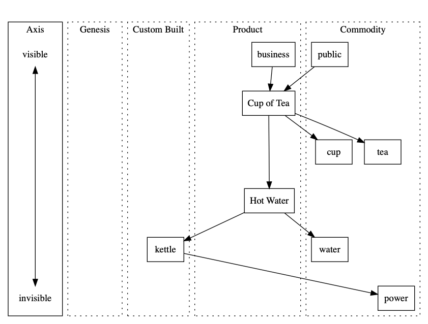
This is one of Simon Wardley’s simple examples where a tea shop has built a custom kettle.
It’s a great example of demonstrating that you are possibly doing something wrong in an obvious manner.
The source for this diagram is here: https://github.com/chriseyre2000/diagrams

Thanks Chris, it’s cool to see this becoming code-supported. Given the tea example, what insight should be extracted from the diagram?
The tea example is a good way to point out custom things that should be commodity.
From a Graphviz point of view I had fun aligning the columns.