I recently saw a tweet with a diagram using the wardley map value chains to document some software.
This looks to be an interesting way of viewing a set of products.
Given my use of graphviz I thought that I would give it a go.
Here is the repo: https://github.com/chriseyre2000/diagrams
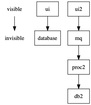
This includes the dot file for the above diagram.
The idea of the value stream is to show the dependencies from the visible to the invisible. The horizontal axis has the custom items on the left and the commodity ones on the right.
I will be experimenting with this for a while.
